This project was about understanding and exploring hierarchy through the work of Jan Tschichold. We created three distinct covers for a published book, each with a different hierarchical relationship. All covers needed to represent the life, work or ideas of Jan Tshichold without explicitly copying his "style."
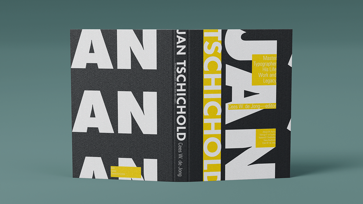
Name dominant cover using just type.

Title dominant cover using photo of Tschichold.

Subtitle dominant cover using image as visual metaphor.
This cover was purely typographic. I chose to compose a cover that would highlight the forms and counter forms of the letters in his name, referencing the idea that Tschichold was a typographic enthusiast. The typeface is futura extra bold. I chose to repeat Jan because of its relative simplicity and economy. I also chose to use the letterforms as a sort of grid to organize the rest of the type on the cover. The rest of the blocks of text hang off of or interact with the larger letterforms in some way. This underscores the idea that, for Tschichold, typography should not be ornamental, but fully integrated into a design both conceptually and visually. So the letters in his name are literally creating the structure of the rest of the composition. I chose yellow to represent the idea that he was a bright and bold visionary; yellow represents optimism and looking towards the future. I chose to make all the text itself white on either the yellow or black background to play with the idea of figure and ground, since Tschichold also brought these concepts into the consciousness of modern design. Overall, I wanted to capture the feeling that while he pursued ideas based on the rational and objective, he infused typography and graphic design with an almost revolutionary energy that still exists to this day.

This cover is more subdued than the one above. I wanted to portray Tschichold as a true scholar, one who took ideas seriously and never wavered in his pursuit of truth, even if that meant admitting he was wrong. The image I chose of Tschichold is one where he appears to be deep in thought reviewing work. I felt this image embodied the idea of a "master": his intense gaze, formal attire, and serious composure all paint a picture of a man whose achievements were driven by his unwavering pursuit of typographic excellence. I also chose to have a black and white color scheme to represent the idea of the timelessness of his ideas, reinforcing the idea of his mastery. I chose to have the image of him twice from two different orientations to embody the idea that he was scientific and thorough in all his work, looking at things from different angles to arrive at a well reasoned opinion. It also operates as a subtle representation of the idea that he changed his views later in his life. I applied a halftone effect in photoshop to again visual represent the idea that he was detail oriented and analytical.

I wanted this cover to represent Tschichold's ideas of form, function and beauty. For the visual metaphor, I chose an abstract architectural image. Tschichold compared technology to nature, stating that they were both beautiful not for aesthetic reasons, but that "the perfection of their appearance is due to their precise and economic expression of their function." I wanted an image that captured the elegance of precise, unembellished forms. I found that images literally representing technology or nature might be misleading for someone who had no prior knowledge of Tschichold. This image, which is an up close shot of an architectural structure, embodies the type of precise, yet organic beauty that inspired Tschichold's typographic ideas while remaining abstract. The abstract feeling of the image also references Tschichold's deep admiration for the abstract artists of his time, which he drew inspiration from. Likewise, the lines could be read as visually referencing typographic lines. I chose to call attention to the white space around the image by having the text interact with it, referencing Tschichold's ideas of the importance of keeping white space active in a design. I chose a cool blue color to reflect Tschichold's methodical approach and legacy as a master of typography.
